Understanding how users scan information to design a web page

With the advent of the digital era, reading habits have evolved. Yes, I know, we still read from left to right 👀. However, users digest information differently on the web. It is crucial to understand these new behaviours in order to adapt your content and design to meet the expectations of your users. In this article, I will delve into the different visual scanning patterns and provide you with practical tips to optimize the user experience on your web pages! So, fasten your seatbelts, we are about to take off 🛫
Traditional Reading vs. Online Reading
When it comes to reading content on the web, users often adopt a different approach compared to traditional reading with physical media. Here are some key trends:
- Visual Scanning: Nowadays, internet users are bombarded with an astronomical amount of information. To cope with this phenomenon and find what they are looking for more quickly, users tend to scan the page for relevant information rather than reading word by word.
- Skimming: Users have a tendency to skim through the content, focusing on elements that catch their attention, such as headlines, subheadings, and bullet points. They often skip less important parts or those that do not meet their immediate needs.
What are the different visual scanning patterns?
Now that we have a better understanding of the behaviours adopted by users on the web, let's dive into the famous visual scanning patterns ☝️. Here are the two most common patterns:
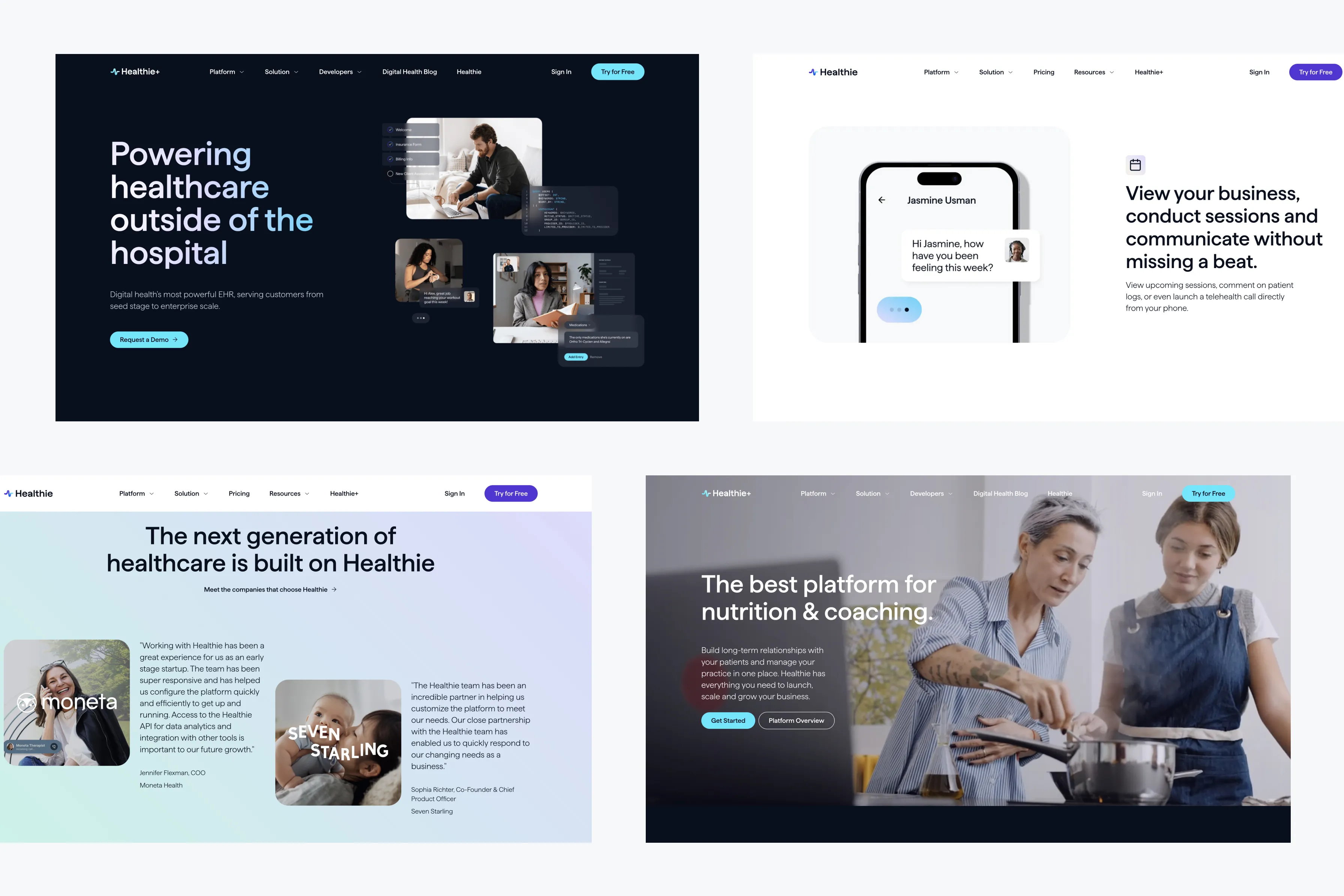
- F-Shape Pattern: This scanning pattern follows the shape of an "F". Users start by reading horizontally at the top of the page, then move down and read horizontally again, creating an F-shaped pattern. This pattern is most common for web pages with a significant amount of content, such as blog articles, news sites, and search result pages.

- Z-Shape Pattern: It follows a Z-shaped trajectory. Users start by reading horizontally at the top of the page, then move diagonally towards the bottom left corner, and then scan the content horizontally. This pattern aims to anticipate the user's behaviour by eliminating distractions and presenting a call-to-action (CTA) as quickly as possible. It is generally applied to pages that are not too text-heavy and contain strong visual elements.

The 3 Golden Rules for Designing Your Web Page ✨
1️⃣ Attention Capture: use impactful visuals and catchy headlines to grab users' attention from the first scan. Highlight key information to facilitate their identification.
2️⃣ Information Hierarchy: organize your content hierarchically using headings, subheadings, and numbered points. This allows users to quickly understand the page's structure and find the information they need.
3️⃣ Content Scannability: design your content to be easily scanned. Use short paragraphs, bullet lists, and bold keywords to facilitate diagonal reading.
Our Practical Tips for Optimizing Your Web Pages:
- Use informative headings and subheadings: Headings and subheadings should provide a clear overview of the page's content and be catchy enough to encourage users to continue reading
- Highlight key points: use visual elements such as icons, graphs, and boxes to emphasize important information.
- Use short paragraphs: short paragraphs are easier to scan and allow users to quickly find the information they are looking for.
- Opt for a clean and minimalist layout: A clean layout with adequate spacing makes it easier to read and understand the content.
As you can see, understanding how users read and scan information online is essential for designing user-friendly web pages for your audience. By utilizing visual scanning patterns such as the F and Z-Shape Pattern and optimizing your design based on online reading habits, you can capture users' attention, prioritize information, and improve the user experience.
However, keep in mind that every website and audience is unique, so it's important to test and adjust your design based on user feedback. And that's exactly what we advocate at Wanderland Agency! A user-centric approach to design web pages that meet the needs and expectations of your audience 😉


